Hello Crafty friends. It’s Donna here, and it’s good to be back and getting crafty here in Tokyo.

I’m so excited to be a part of the #spreadjoynotgerms blog hop, as a part of the Pink and Main team. What a great fun name for a blog hop, even if the reason for the hop is not fun at all! With so many of us staying home, it’s a great opportunity to encourage other crafters and creative community in this lovely crafting world of ours. There are a bunch of prizes to be won, and the more blogs you comment on, the better your chances of winning. Please leave a comment below. I’d love to know what you do to restore your crafty mojo when it goes missing!
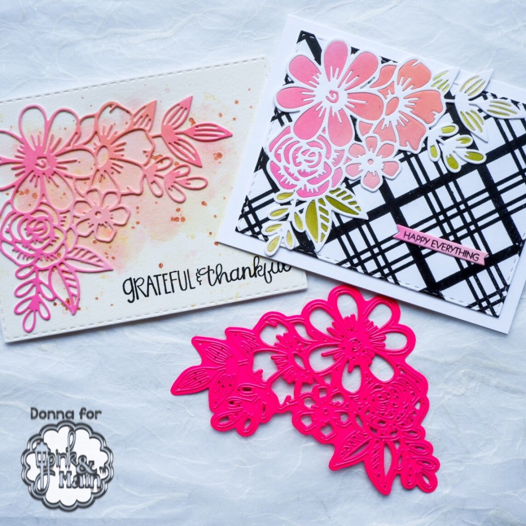
I’ve created two cards today using the one die cut and two very different backgrounds.
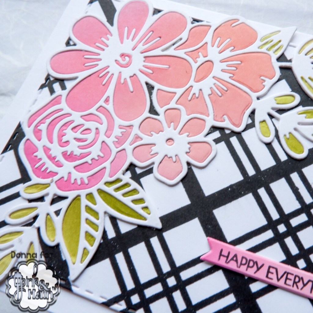
For the first card, I created a plaid background (random fact – we don’t call it plaid in Australia, it’s called check) I used the Plaid 1 and Plaid 3 stamps from Pink and Main and Versafine Onyx Black ink to make the bold background. These stamps line up beautifully when placed in the corner of my MISTI, and I was able to stamp each layer twice to get good ink coverage. I cut this panel using the a stitched rectangle die.

I cut the Floral Corners Dies twice from white card, and layered them up. I blended ink onto two pieces of card, in mixed pinks and mixed greens, and cut the die from these pieces too. I stuck the outline down to the check piece, and then it was a matter of playing jigsaws and slotting the pieces into the holes! The sentiment which comes from the Special Day stamp set was popped up with some foam tape.
The second card is much softer, but it uses the same pink die cut piece from the first card. I used the same inks – Distress Oxides in Picked Raspberry, Worn Lipstick and Spun Sugar as well as a touch of Altenew Butternut ink to turn the pinks more coral, to create the background on a sheet of watercolour paper. I used lots of water to get a soft look. Once this was dry, I spattered the colours onto the paper, as well as a little copper coloured metallic paint that I had in my stash.

Once again, the diecut is two layers high, to give some extra dimension. The sentiment comes from this Fall Sentiments stamp set and I stamped this directly onto the watercolour panel with Versafine Onyx Black ink.


Well done to Catherine Pooler for thinking of this great idea, to Erika Post for organising us all! What a massive job! Below are the companies that are participating in the hop, and have prizes to share. You have until April 24 to comment on as many blogs as you can, and the winners will be announced on the Catherine Pooler and HedgeHog Hollow blogs on April 27.

Your next stop on the hop is Rosemary Bridges. She is an amazing colourist, and I know you’ll enjoy seeing her creation. If you get lost, please head to Catherine Pooler’s blog, or the Hedgehog Hollow blog, where you can find your way again.
I hope that you find heaps of inspiration following along this hop, and are rewarding with an overflow of crafty mojo!
If you’d like to see more of my cards, I put them all up on my Instagram account. Only a small portion make it to my blog! I look forward to hearing your comments. Don’t forget to leave lots of love all along the hop.
Until next time, may your days be full of joy, not germs!
Blessings,

I love the inlay you did!
LikeLike
What beautiful cards! Thank you for sharing. Whenever I lose that mojo, I try to find a blog post or idea from someone who has one of the same (or similar) stamp sets I have, then attempt to CASE it. Usually, that jump-starts new ideas for me.
LikeLike
I really like these! Great technique!
LikeLike
Two beautiful technique cards. Just love the inlay on that dramatic background. Beautiful!
LikeLike
Love both cards! To restore my moko, I read blogs like yours and watch YouTube tutorials!
LikeLike
I love both of your cards. The corner die cut is great. thank you
LikeLike
I adore this die cut and you may just have enabled me to get searching for it at Pink and Main, new to me. I love the simple card the best but my style is really clean and simple. I’m going to subscribe to your blog. Would love to see more from you!
LikeLike
Lovely cards! Thank you for sharing.
LikeLike
What gorgeous creations with this sensational die!! So very beautiful!
LikeLike
I really like that corner flower die – going on my wishlist! Love how you’ve paired it with the plaid/check stamp and used both the outline and pieces to fill in a white outline. Great cards!
LikeLike
I love the choice of the background colors with the flower die. Pretty!
LikeLike
Really like both cards. Inlay can be fun or a pain. Love the background.
LikeLike
I love the plaid (or check) card! That’s my favorite pattern and the flowers just pop against that background. Lovely cards!!
LikeLike
Love the techniques used on your stunning cards. Thanks for sharing.
LikeLike
Absolutely stunning cards, love the dies!
LikeLike
I love the mix of geometric and floral on this card. ✨
LikeLike
I love both of your cards and really like the flowers with the plaid (checks) thanks for sharing
LikeLike
Great cards. Love the plaid.
LikeLike
Beautifully done!
LikeLike
I love both cards. They are each so different, but using the same die! The colours are lovely too! xx
LikeLike
Love how you used these Corner Floral Dies on both cards and came out with two totally different looks!!! Amazing! Great compositions! Thanks for inspiring me 🙂
LikeLike
I love how you used the inside of the pink flowers to insert into the white flowers. Wonderful use of supplies. I’m loving that floral die and just might have to purchase it!
🙂 Marie
LikeLike
Love the cards and colors you used.
LikeLike
I love these cards. When I’m feeling a little lost, I watch some you tube videos for inspiration.
LikeLike
You made beautiful cards with this die 💙😊
LikeLike
Very pretty cards!
LikeLike
Love both of your cards!
LikeLike
Amazing what such different looks with the same die cut. Very nice. TFS
LikeLike
Two beautiful cards. You showed the versatility of the die.
LikeLike
Both cards are beautiful! Thanks for sharing!
LikeLike
I like the second one the best.
LikeLike
Love these!
LikeLike
I love bold cards. They are so pleasing to the eye. Thank you for sharing
LikeLike
That second card really speaks to me! I LOVE IT!
LikeLike
Pretty cards! I really like your choice of colors – such pretty pinks and corals.
LikeLike
I love how the flowers pop from the black! Gorgeous!
LikeLike
Sovereign never stacked my dies! I love it and can’t wait to try it!
LikeLike
Great combinations!
LikeLike
I love the colors you selected for your cards. One is prettier than the next. Thanks!
LikeLike
Oh wow….love your cards. I’m INSPIRED, heading to my craft room now😁
LikeLike
Gorgeous die! Love how you used it different ways.
LikeLike
FAB oxide ink background, and really awesome cards. Thanks so much for sharing your creativity and inspiration. This is such a special hop, and I thank you for being part of it.
I’m not on the blog hop list, but I am participating as part of the Paper Sweeties DT if you’d like to stop by and see my project. Hope you’re staying safe and healthy.
Blessings,
Karen Letchworth
http://www.karen-mycuprunnethover.blogspot.com
LikeLike
I like both cards, but I like the first the best. It’s so graphic and pretty. Thanks for taking part in the blog!
LikeLike
Love the two looks from one die.
LikeLike
Beautiful project. Love the soft colors. Thanks for sharing
LikeLike
Love the die. You made beautiful cards with it.
LikeLike
Beautiful cards! I really like the black background.
LikeLike
Love these
LikeLike
Lovely cards! Thanks for sharing and also for all the details. Be well and stay healthy.
LikeLike
very pretty cards
LikeLike