This week’s post starts with a set of (almost) identically coloured Peonies from Paper Rose.
I coloured these with the same markers that I used to colour the fish in my previous post, but by mixing colours together and applying watercolour style ‘washes’ of copic colour, I was able to achieve a much more muted, flowing colour palette than the previous bright, cartoon style images.
Firstly, here are the coloured images. The flowers are a mix of solid blending, and a more ‘flicking’ style colouring. I cut the flowers out with the matching die, and fussy cut the leaves, leaving the same amount of border that the die left around the flower.

Next, I prepared three different backgrounds. The first of these was very simple. I used a big black marker to draw a thick, and a thinner line, and then some black paint to add spatters. I stamped a sentiment from the Bird Day stamp set. Adding strong geometric elements is one of my favourite things to do with floral stamps. I think it grounds them nicely. I also adore spatters.

Next, the image was added using some foam tape, and this is what the card looks like.

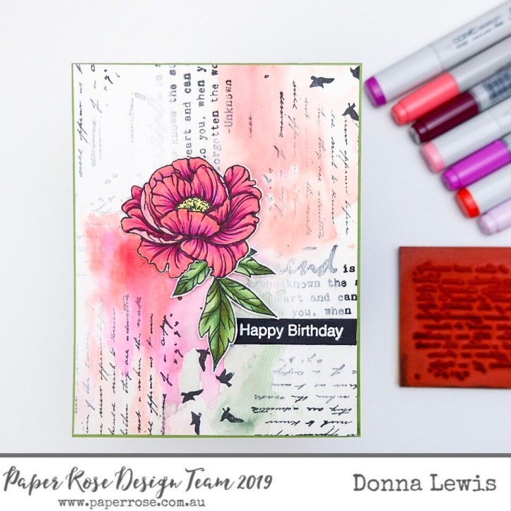
For the next background, I went into completely new territory. I made a mixed media background, even using gesso. Quite a departure for a Clean and Simple (CAS) girl like me!
I added layers of stamping, using birds and elements of text from the Bird Day stamp set, as well as the gorgeous Vintage Letter stamp. I then used some white gouache to tone down the black, and then a layer of clear gesso and some Zig Clean Colour brush markers, and Altenew Artist markers. I used a spray bottle, and let the colour run to the edges. I already knew where I wanted the flower to sit, so I left that spot blank, but put heavier colour just under it to act as a cast shadow.

Once the peony was added, flow of the paint made more sense. I stamped the Happy Birthday sentiment onto black cardstock and embossed it in white.
Finally I went for a super subtle, almost white on white background. I used watercolour paper and gave it the lightest of pink and yellow washes and a few light spatters too.
I then die cut the centre of the Oval Lattice Frame, and doctored it severely with my small scissors to give it a more organic shape. One thing I didn’t realise about this super subtle background is just how hard the card would be to photograph.
Where’s the photo of this background, you ask? Let’s just say I don’t want to talk about it and leave it at that!
Here is a photo of the finished card, however, and you can see that the background is more about texture than colour. I have popped the die into the shot so you can see how much you can stretch your dies by altering them.
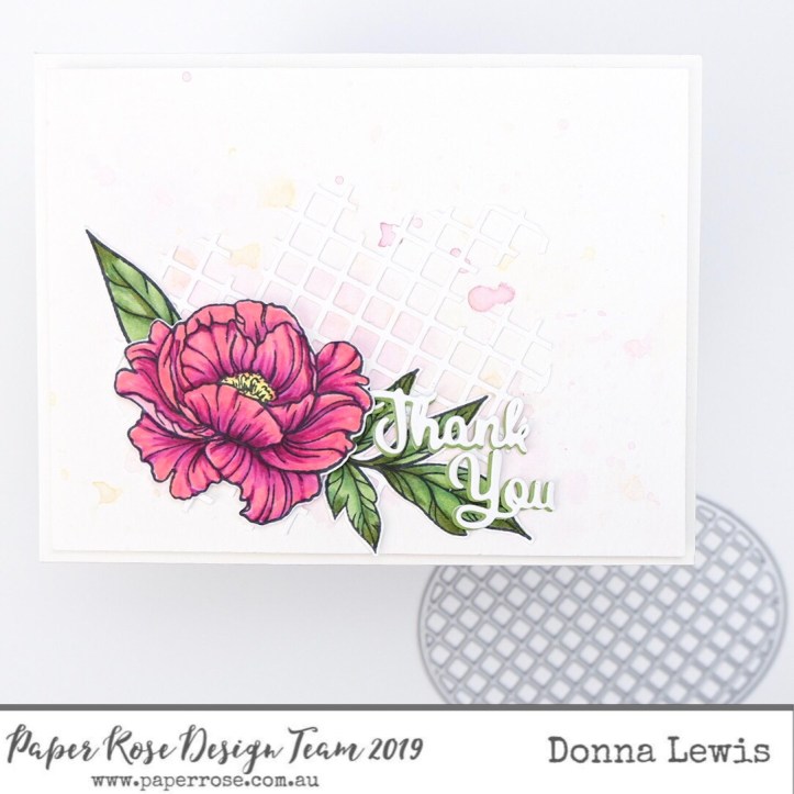
The Thank You sentiment was cut three times. I layered these, putting the green layer in the middle, and slightly off setting it to give a drop shadow effect.
Finally, I have included some close up pictures for you. I hope you enjoy these cards, and are inspired to mix up your backgrounds or even try something completely new.


If you enjoyed these cards, and would like to see more, you can find me on Instagram.
Until next time, may your days be full of beauty.
Blessings,

These are really ingenious Donna. I adore the second card. Love the vintage feel of it. Thanks for the tips and tricks 💕
LikeLike