I recently had the chance to travel back to Australia from Japan for my daughter’s wedding. As always, I took some craft with me. I stamped a bunch of images, and packed a bundle of copic markers. I chose bright colours and took flower and ocean images to colour. In amongst Christmas, the wedding and all the associated festivities, I managed a little colouring, and finished up when I got to back to Japan. It was a whirlwind trip, but an absolute joy.
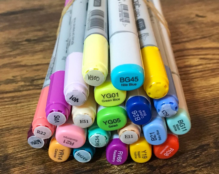
At the end of this little burst, I had a bunch of fish and mermaid images. I’ve used the same set of images to make three cards, but varied the background to give three different looks. The main set I used was the Mermaid Magic stamp set from Paper Rose and I used the matching dies to cut these out once they were coloured.

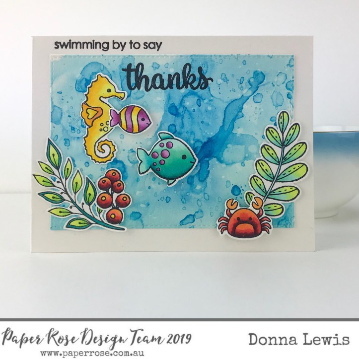
To make the background for this card, I blended distress inks in Salty Ocean (an obvious choice!), peacock feathers and tumbled glass, blending from darkest to lightest. I spattered the finished panel with water to give it the look of water bubbles. I then used the Under the Sea Border, and blended more distress inks onto this to give the look of sand blending up into the different corals and seaweeds. The rocks are front he same die set, and they made a lovely spot for my mermaid to sit.
This second card is made with exactly the same distress ink colours, but this time, I smooshed them onto a plastic mat, sprayed them with a little water, and picked the colours up by pressing the paper onto my mat. I dried the first layer with my heat tool and then went in another three times for more ink, this time just dipping the paper lightly onto the ink and drying between layers. You may notice some imposters on this card! The seaweed is actually leaves and berries from the Doodle Flowers stamp set.
The sentiment is from the mermaid set, and I’ve used the same sentiment in all three cards.

Finally, I’ve used coloured papers to create the final scene. I have added just a little distress ink onto the seaweed. Using the background papers was really interesting as I got to ‘interview’ many papers, including very pale papers, busy papers and bright papers. In the end, I decided on this lovely rich dark paper with a slight horizontal pattern to make a nighttime scene. The bright colours really glow against the darker background.
If you are interested in seeing more of my cards, you can always find me on Instagram.
Until next time, may you find a little crafty space in your life,
Blessings,
Donna

[…] coloured these with the same markers that I used to colour the fish in my previous post, but by mixing colours together and applying watercolour style ‘washes’ of copic […]
LikeLike